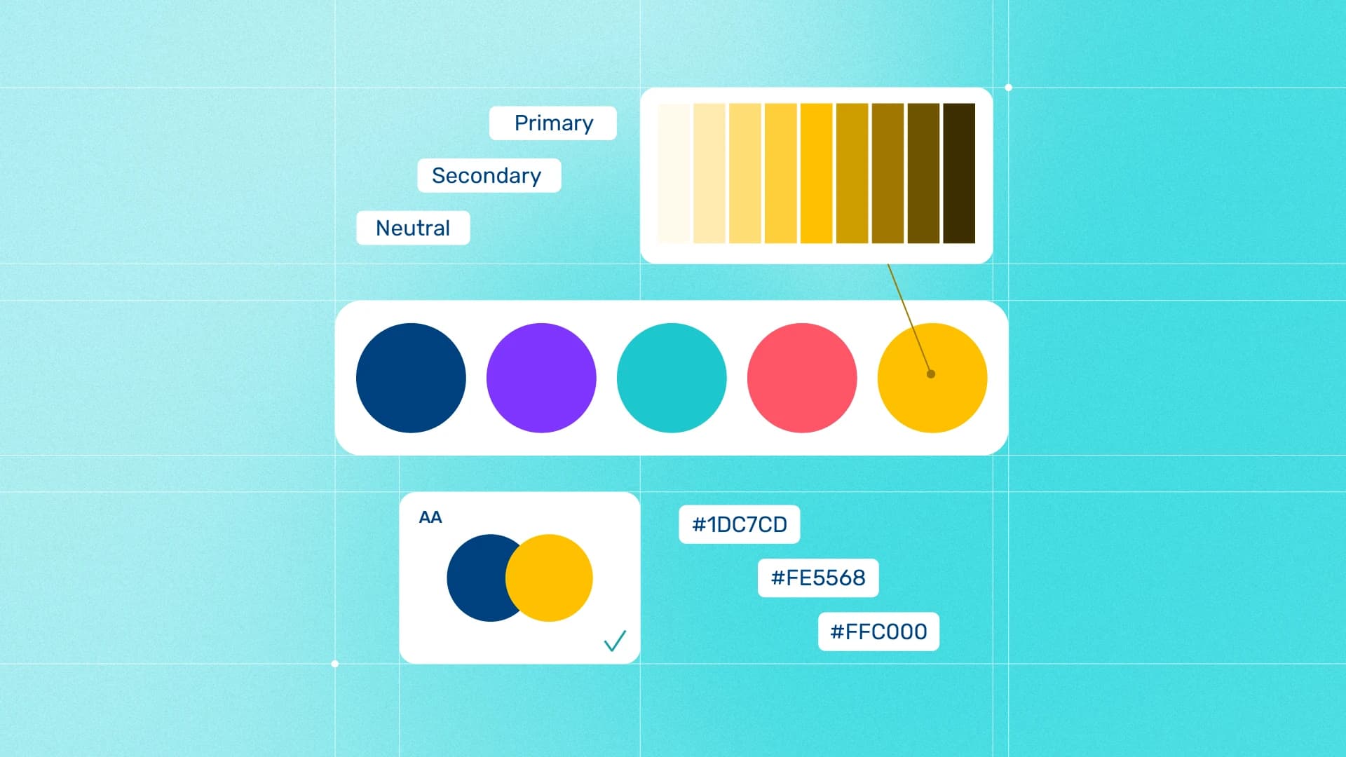
At some point in almost every brand identity project, the color question changes.
Early on, you’re asking:
Does this palette feel right for the brand?
Later, you’re asking:
Can people actually use this?
That second question is where things get more complicated.
You might have a great primary color, but still need supporting tones. You might need to figure out which colors work for text, backgrounds, or buttons. You may need a proper tonal scale for a digital product. And before you hand everything over, you probably want to know which combinations are actually readable.
No single color tool is especially good at all of this.
Some are great for exploring ideas. Some are better once the palette is already approved. Others are really just validation tools you open for five minutes before finalising the guidelines.
So instead of treating these as eight interchangeable palette generators, I’ve organised them around the part of the branding process where they’re actually useful.
If you only need a quick shortlist:
- Adobe Color is the strongest all-rounder.
- Coolors is great for fast palette exploration.
- Realtime Colors helps turn colors into real text, background, and accent roles.
- Leonardo is useful when a brand needs a deeper digital color system.
- Color Scales I/O is especially useful if your workflow lives in Figma.
- *ContrastGrid.com is excellent for testing lots of color combinations at once.
- Figma Color Contrast Checker is better when you just need to check one pair.
- Color Hunt is mostly about finding visual direction and inspiration.
Let’s get into where each one fits.
1. Adobe Color
Best for turning an existing brand color or image into a more complete palette
Adobe Color is probably the most useful all-rounder on this list.
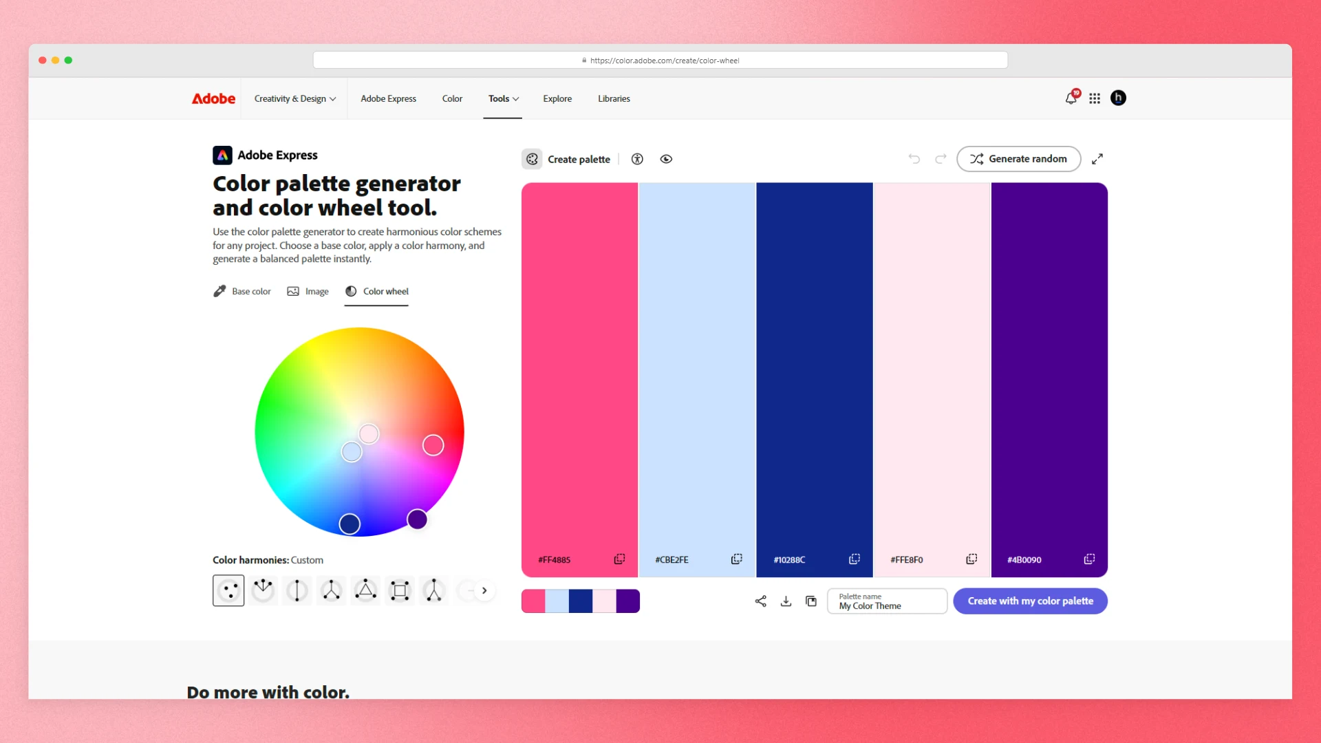
I wouldn’t necessarily start every identity project here. But once you already have a strong hero color, logo, photograph, or visual direction, it becomes much more useful.
You can build palettes using different color harmony rules, extract colors from images, and create themes with up to 10 colors. That extra room matters. Five colors might be enough for a small identity, but once you start adding supporting tones, neutrals, or digital applications, it can get limiting pretty quickly.
What I like most is that Adobe Color sits somewhere between exploration and documentation.
You can start with something loose, refine it into a more intentional palette, and then check some of the practical details before carrying the colors into your actual brand guidelines.
Adobe also includes accessibility tools for checking contrast and simulating different types of color-vision deficiency.
And if you already work heavily in Illustrator, Photoshop, or InDesign, Adobe Color fits into that ecosystem through Creative Cloud Libraries.
It can also give you more than HEX values. Adobe lists outputs including RGB, LAB, CMYK, HSV, Pantone, CSS, XML, and LESS.
I still wouldn’t treat an automatically generated CMYK or Pantone value as the final production specification for an important print job. Print color depends on the actual process, profiles, materials, and output conditions. Adobe has its own guidance around print color management, and Pantone recommends working with physical references when accurate reproduction really matters.
But as a tool for developing and documenting the palette before that stage, Adobe Color is hard to beat.
Use it when: you already have the beginnings of the identity and want to turn them into a more complete, documented color system.
2. Coolors
Best for exploring palette ideas quickly
Sometimes you don’t need a complicated color system.
You just need to see some options.
That’s where Coolors is really good.
It lets you move very quickly from one promising color to several possible palette directions. You can lock the colors you already like, keep generating around them, and explore without spending half an afternoon manually adjusting swatches.
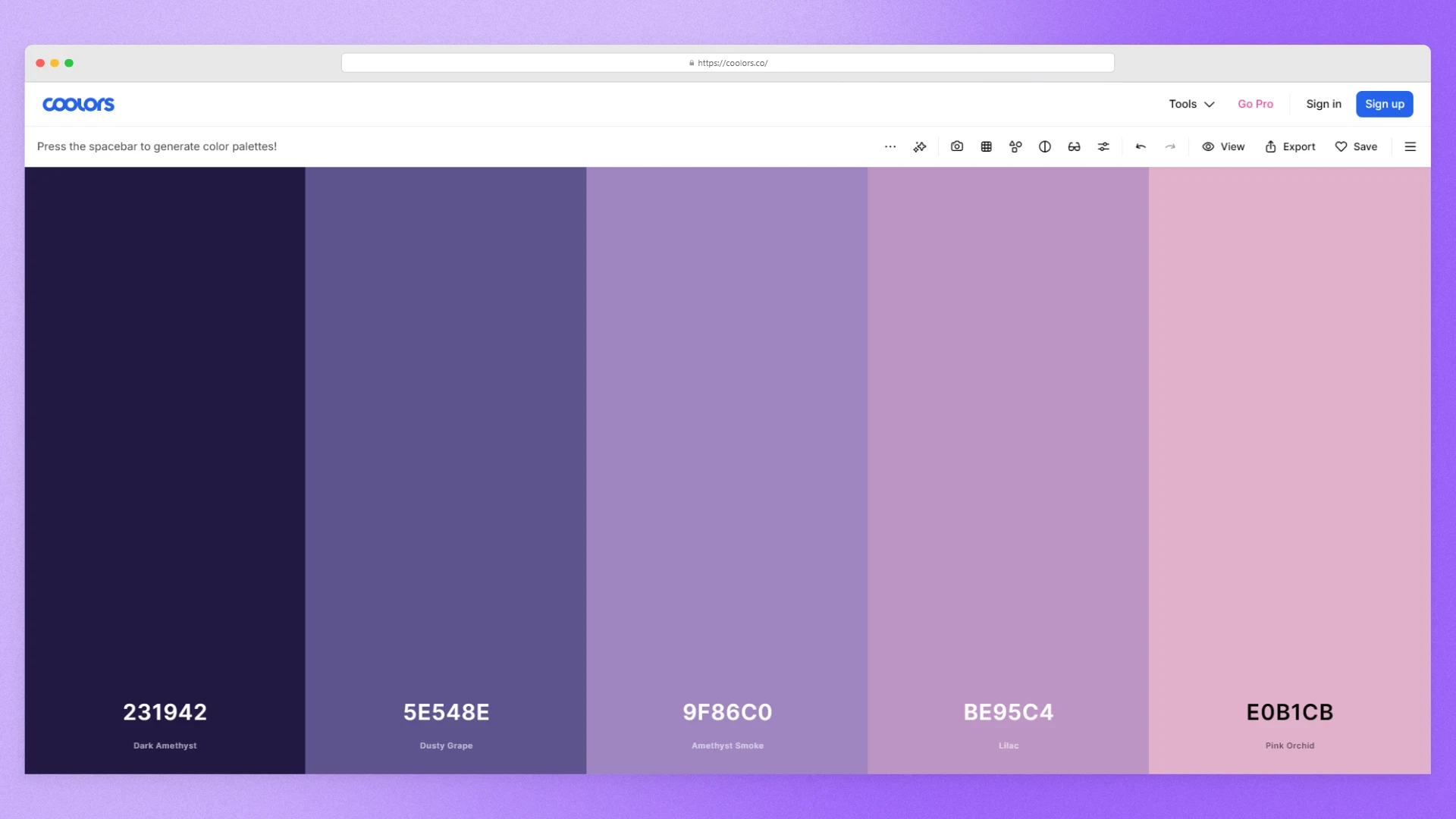
For early exploration, that speed is genuinely useful.
The free plan currently supports palettes of up to five colors and lets you save up to 10 palettes, according to the Coolors pricing page.
Five colors is enough for a lot of identity projects:
- Primary
- Secondary
- Accent
- Dark neutral
- Light neutral
Where Coolors becomes less useful is later in the process.
Features like image picking, palette-level contrast checking, variations, advanced exports, and larger generated palettes are listed under the Pro plan.
So I wouldn’t try to make Coolors do everything.
Use it for what it’s good at: getting from “I have one or two colors I like” to “these are the three directions worth exploring.”
Then move on.
Use it when: you’re still exploring the palette and want good options quickly without overthinking every individual value.
3. Realtime Colors
Best for figuring out what each color should actually do
One of the easiest mistakes to make with a brand palette is stopping too early.
You have five nice colors.
Great.
But which one is the background? Which one is used for text? Which one carries buttons or calls to action? Is the accent actually useful, or does it only look good sitting beside the other swatches?
Realtime Colors is useful because it forces the palette into something closer to a real interface.
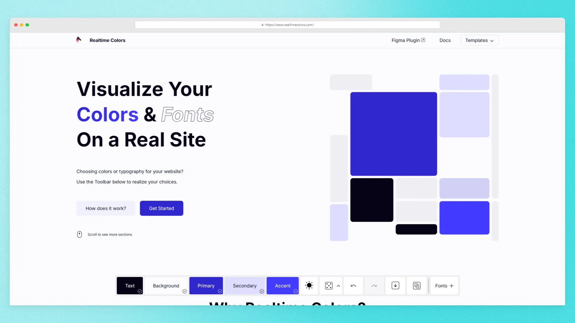
Instead of showing colors as isolated chips, it gives them roles such as:
- Text
- Background
- Primary
- Secondary
- Accent
Then you can see those decisions applied to a live page.
For digital brands in particular, I find this much more useful than staring at a palette strip.
A color can look great beside four other colors and still be terrible once you ask it to carry body text, buttons, navigation, or large areas of a website.
Realtime Colors also shows contrast information while you work and describes itself as 100% free.
Once you’re happy with the system, the site lists export options including CSS, SCSS, Tailwind, custom code, shades, and downloads.
Obviously, that makes it much more relevant to screen-based brands than print-heavy ones.
But if the identity is going anywhere near a website, SaaS product, or mobile interface, it’s a useful reality check.
Use it when: the palette already exists and you need to decide how those colors behave in an actual digital experience.
4. Leonardo
Best for building a deeper digital color system
Leonardo is where things start getting more technical.
And that’s not necessarily a bad thing.
I just wouldn’t recommend opening it while you’re still wondering whether the brand should be blue or green.
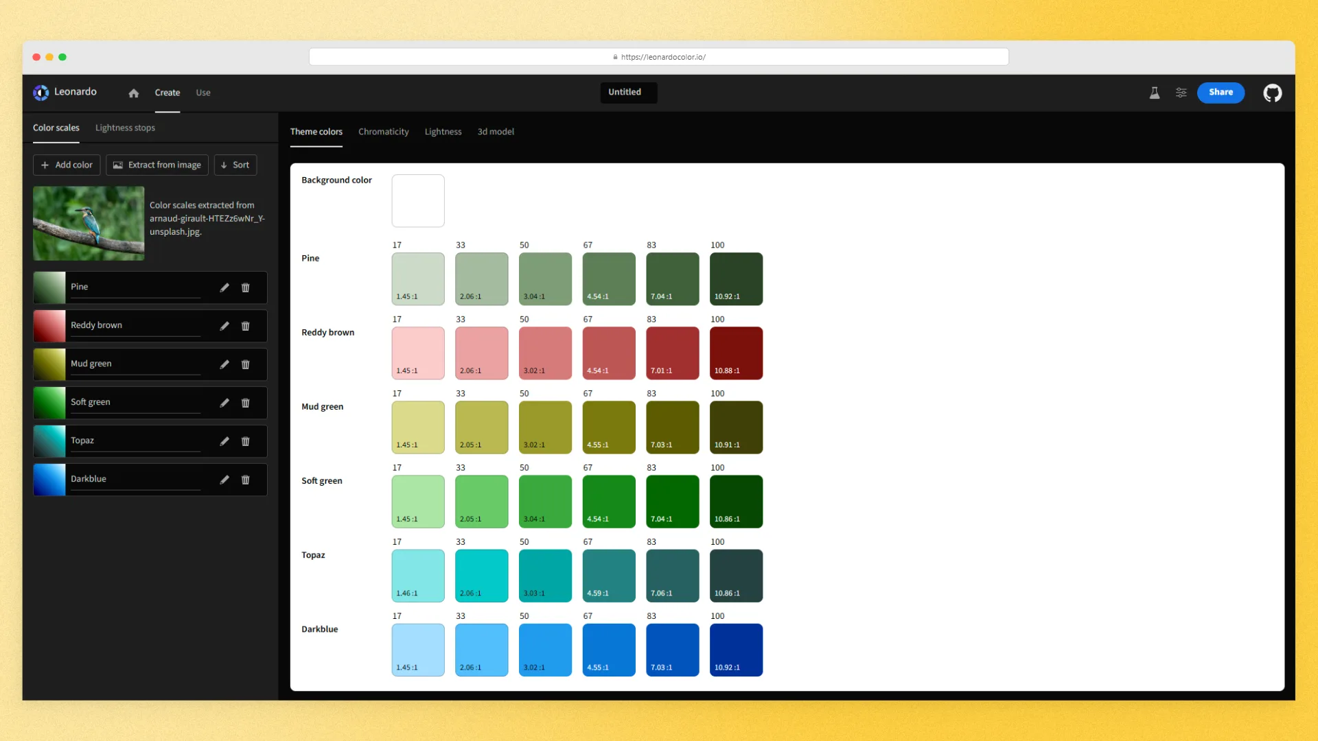
Leonardo becomes useful after the core identity decisions have already been made.
Let’s say you have a primary blue.
Now the website or product team needs:
- Lighter backgrounds
- Dark states
- Several text values
- Hover states
- Borders
- Accessible combinations
- A proper tonal scale
At that point, manually creating Blue 100, 200, 300, 400 and hoping they all work together isn’t especially convincing.
Leonardo takes a more systematic approach.
The Adobe open-source project focuses on contrast-driven color themes and scales, which means you can build the system around how the colors actually need to perform rather than choosing every tint by eye.
It also supports adaptive themes, color-vision differentiation checks, and exports such as SVG, CSS custom properties, and design-token data.
The source code and implementation details are available in Adobe’s Leonardo GitHub repository.
For a simple cafe identity with six colors and a packaging system, I probably wouldn’t bother.
For a SaaS brand that needs to extend into a product UI, it becomes much more interesting.
Use it when: a finished visual identity needs to grow into a proper digital color system with tonal scales and accessibility requirements.
5. Color Scales I/O
Best for building color scales inside a Figma-heavy workflow
Color Scales I/O solves a similar problem to Leonardo, but I think it will feel more natural to designers who already spend most of their time in Figma.
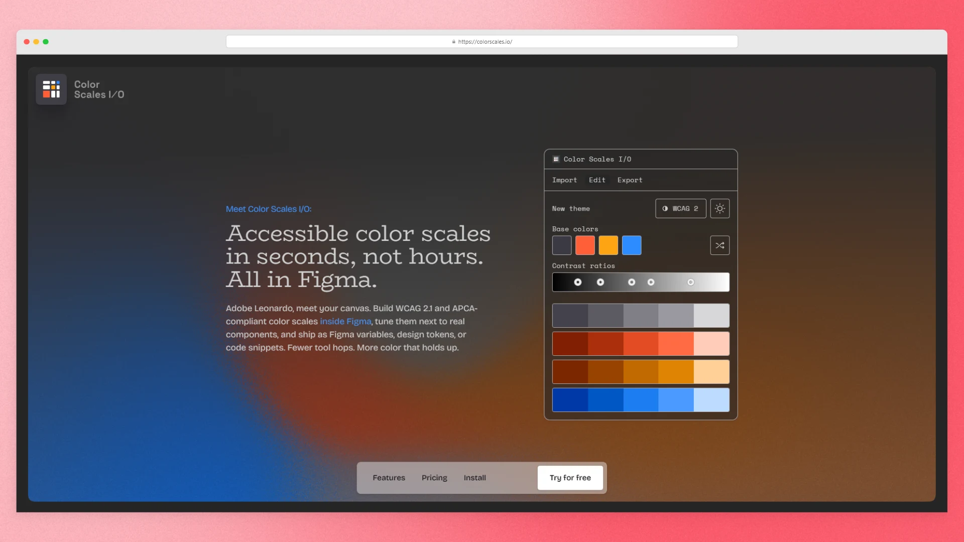
Its Basic tier is described as free forever and includes Figma import, image extraction, advanced editing, and WCAG 2 plus APCA checks.
The biggest reason I’d use it is context.
When you’re creating a tonal scale, the actual question isn’t:
“Do these 10 swatches look mathematically nice beside each other?”
It’s:
“Which of these colors do we actually need?"
Being able to refine colors around real layouts and components makes that decision easier.
You might generate ten steps and discover that the brand only really needs six.
That’s fine.
Not every shade a tool generates deserves to become part of the official brand system.
I’d rather document a smaller set of useful colors than give the client a giant palette nobody understands.
Color Scales I/O also includes accessibility checking while you build, which makes it especially useful for digital-facing identities.
The main limitation is the free plan. Exports are limited and reset periodically, so I’d check the current Basic plan limits if exports are going to be a big part of your workflow.
Use it when: you work primarily in Figma and need to turn a few approved brand colors into a practical digital scale.
6. ContrastGrid.com
Best for testing lots of foreground and background combinations at once
This one is much less exciting.
I mean that as a compliment.
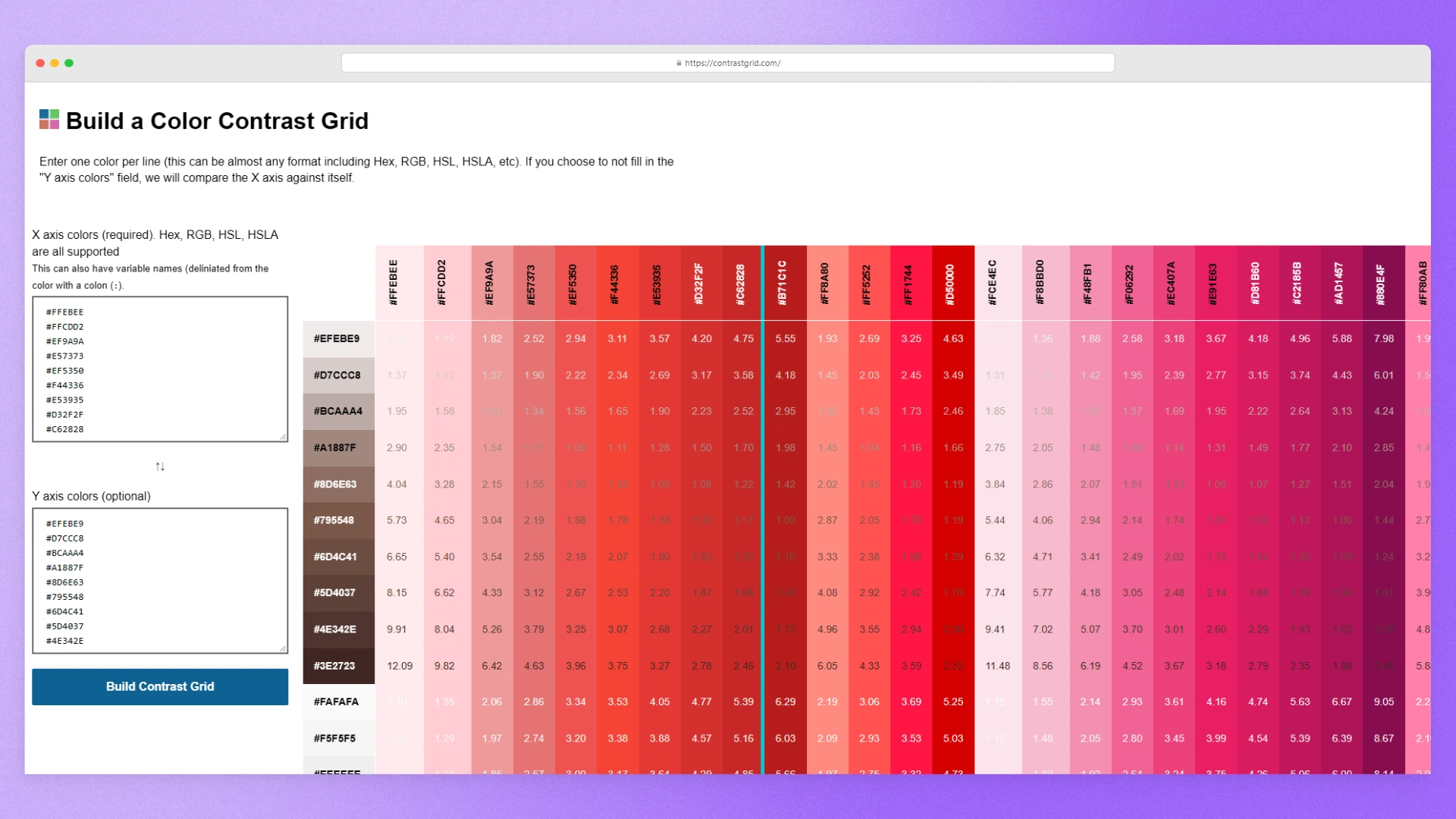
ContrastGrid.com has a very specific job: take a group of foreground colors and background colors and show you which combinations work.
That’s it.
And near the end of a branding project, that can be exactly what you need.
Imagine you have:
- Two brand colors
- Three supporting colors
- Black
- Cream
- White
You now need to decide which combinations are approved for text.
You could copy every pair into a contrast checker one by one.
Or you can put the palette into a matrix and see the whole thing at once.
That makes ContrastGrid.com especially useful when you’re preparing an approved color combinations section for the brand guidelines.
Instead of writing something vague like:
Make sure there is sufficient contrast.
You can actually decide:
- White text is approved on brand blue
- Cream is decorative only on this background
- This accent should never carry body copy
- These two colors should not be combined for functional UI
The grid shows the contrast ratio for each pairing, which you can compare against WCAG thresholds. WCAG 2.2 uses 4.5:1 as the minimum contrast ratio for most normal text and 3:1 for large text. A 3:1 threshold also applies to certain meaningful non-text interface elements, explained further in the WCAG non-text contrast guidance.
It won’t help you choose a better palette.
But once you’ve already chosen one, it can help you create much better usage rules.
Use it when: the palette is finished and you want to approve or reject combinations before documenting them.
7. Figma Color Contrast Checker
Best for checking one color pair quickly
Not every project needs a giant contrast matrix.
Sometimes you’re working on the guidelines and just think:
Can I actually put white text on this color?
For that, Figma’s Color Contrast Checker is easier.
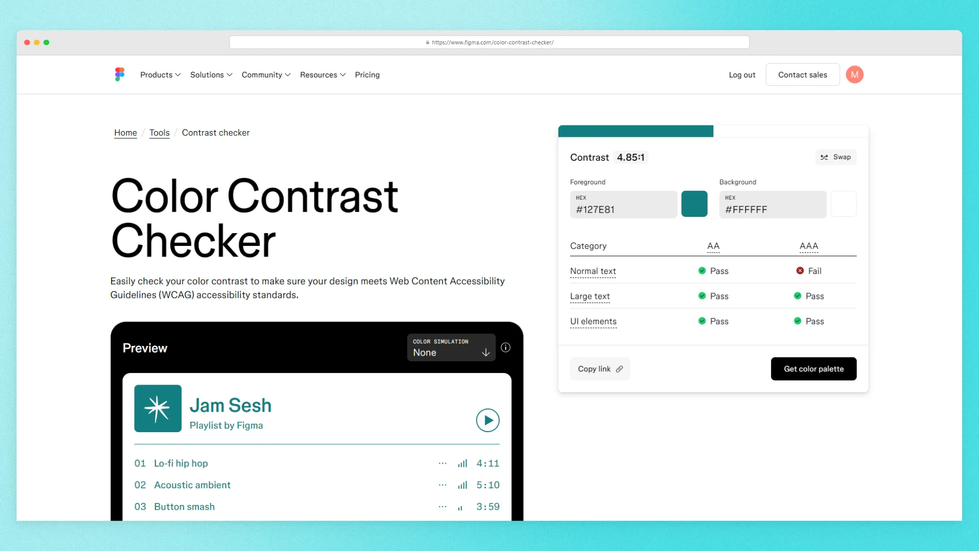
You add the two colors and get the answer.
The checker shows AA and AAA results for normal text, large text, and UI elements. It also includes simulation modes for protanopia, deuteranopia, tritanopia, and achromatopsia.
That makes it useful for the small decisions that come up constantly while designing.
- Can the primary color carry white type?
- Does this neutral work as body text?
- Can the accent be used for a button?
- Does the logo still hold up against this background?
It’s not a palette generator and it won’t help you build a full color system.
That’s fine.
You don’t need one tool to do everything.
Use it when: you already know exactly which two colors you want to use together and just need to check the pairing.
8. Color Hunt
Best for finding a visual direction before you build the real palette
Color Hunt belongs at the opposite end of the process.
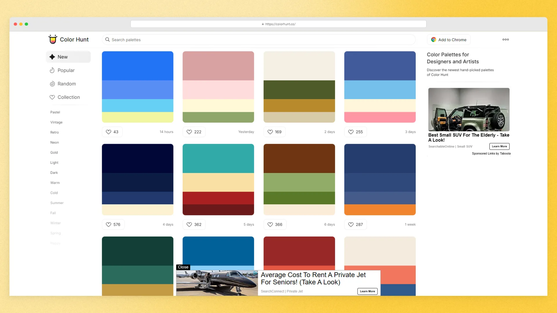
This is not where I’d validate the final brand system.
It’s where I’d go when the project still feels visually open.
Maybe you know the brand should feel warm and playful, but you’re not sure what that means yet.
Or you have a strong logo direction, but every palette you make feels predictable.
Color Hunt gives you a huge library of curated palettes that you can browse by different colors, moods, and styles.
According to the Color Hunt support page, the collection has been manually curated since 2015.
That curation is what makes it more interesting to me than endlessly pressing a randomize button.
You can quickly scan a lot of visual territory and start noticing patterns:
- Warmer neutrals
- Softer contrast
- Unexpected accents
- Combinations you wouldn’t have tried
- Palettes that immediately feel wrong for the brand
I wouldn’t copy a Color Hunt palette, call it the brand system, and move on.
That misses the point.
Use it to find territory.
Then take that inspiration back into the identity and build a palette that actually belongs to the brand.
Use it when: you’re early in the project and need inspiration more than validation.
So, which color tool should you actually use?
Probably more than one.
That’s the main takeaway here.
The mistake is looking for a single “best color tool” when these tools solve different problems.
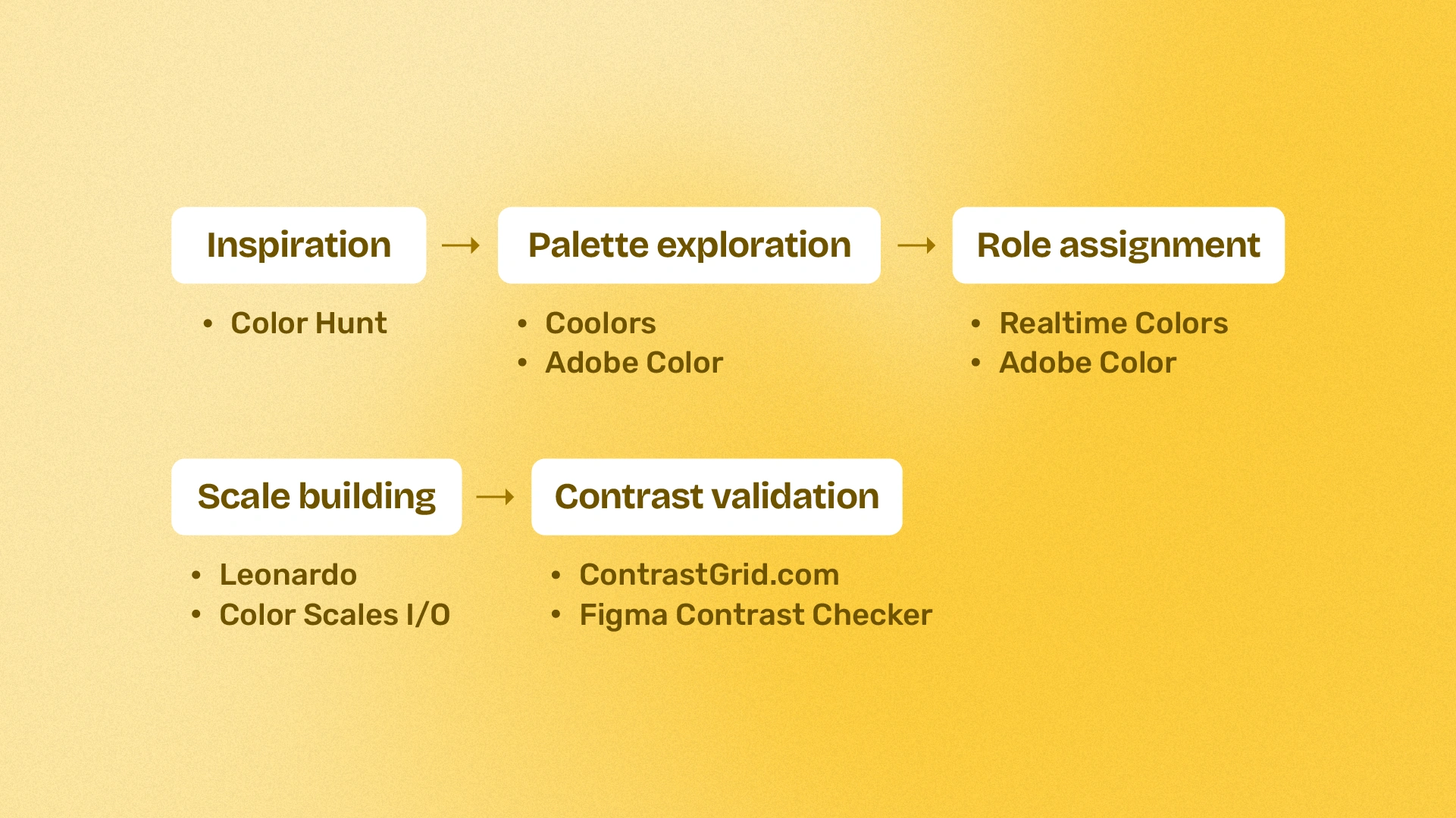
If I were building a brand identity from scratch, the workflow might look something like this:
For inspiration:
Color Hunt
For quick palette exploration:
Coolors or Adobe Color
For assigning digital roles:
Realtime Colors
For deeper tonal systems:
Leonardo or Color Scales I/O
For final contrast validation:
ContrastGrid.com or Figma Color Contrast Checker
You obviously don’t need to use all eight on every project.
A small visual identity might only need Coolors and one contrast checker.
A SaaS rebrand that has to extend into a product interface might need Adobe Color, Realtime Colors, Leonardo, and a proper contrast pass.
The tool should match the problem you’re solving.
A good color palette is only the beginning
The final palette is useful.
But what really makes a color system usable is the guidance around it.
- Which color is primary?
- Which ones are supporting?
- Which combinations are approved?
- What should be used for text?
- Which colors are decorative only?
- Are there lighter or darker values?
- What happens in digital applications?
Those decisions are what turn a collection of swatches into an actual brand system.
And they’re also the part that should eventually make it into the brand guidelines.
Once those decisions are made, you need somewhere to document them clearly so the client isn’t left guessing six months later.
That’s where Brand Bento comes in.
Brand Bento helps brand designers turn finished identity work into polished online brand guidelines, bringing things like color guidance, typography, logos, usage rules, and downloadable assets into one live guide.
The color tools above help you build the system.
Brand Bento helps you hand it over.