Most brand guidelines get bloated in the same moment: right after the identity work is done, when you’re trying to turn good design into a “proper” set of guidelines.
That’s where designers start wondering if they need 40 pages. Or a mission statement section. Or a photography chapter for a client that has exactly three stock photos and no plans to shoot anything.
The better answer is much simpler:
Brand guidelines should include the minimum set of rules, examples, approved assets, and access instructions someone needs to use the identity correctly without having to ask you what to do next.
Not the most pages. Not the most impressive table of contents. Just the parts that help real people make the next decision.
Official brand systems back that up by being all over the map. Dropbox’s public guidelines are relatively compact. Illinois and the University of Houston go much broader into applications, photography, editorial guidance, and downloads. Microsoft’s current Brand Kit model combines guidelines with approved assets, templates, imagery, typography, voice, and usage rules.
So if you’re a freelance brand designer, the real question isn’t:
What pages should a brand guide have?
It’s:
What does this client need to know, see, download, and find later for this identity to survive contact with actual work?
Start with the questions clients will actually ask
In practice, most clients don’t come back to guidelines looking for theory. They come back because they need an answer.
Usually something like:
- Which logo do I use here?
- What colors are approved?
- What fonts am I supposed to use?
- Where are the files?
- Which version of this guide is current?
That’s not a formal industry statistic. It’s just a very useful lens for building guidelines that people can actually use.
If your guide answers those five questions quickly, it’s already doing a lot of the heavy lifting.
The core layer every brand guide needs
For most identity projects, the essential layer is pretty consistent:
- A quick orientation
- A logo system
- A color system
- A typography system
- Approved asset access
- One clear current source
Here’s the practical version:
| Component | Why it matters | What good looks like |
|---|---|---|
| Quick start | People need fast answers before they need full theory | A short opening that points to logos, colors, fonts, files, and contact |
| Logo system | A logo file alone doesn’t explain which version belongs where | Variants, usage context, clear space, minimum size, background rules, misuse examples |
| Color system | Swatches alone don’t tell people how to use color | Roles, values, pairings, backgrounds, accessible text combos for digital |
| Typography system | Font names don’t explain hierarchy or access | Roles, weights, styles, pairings, substitutes, source/licensing notes |
| Approved asset access | Knowing the rule is useless if the right file is buried in a folder somewhere | Clear downloadable assets, good filenames, obvious file-purpose guidance |
| Current source | Old copies spread fast | Version/date, owner, and one canonical place to return to |
The important bit is that these are not just identity specs. They’re decision tools.
1. A quick start beats a dramatic intro
The first page of a guide does not need to sound important.
It needs to be useful.
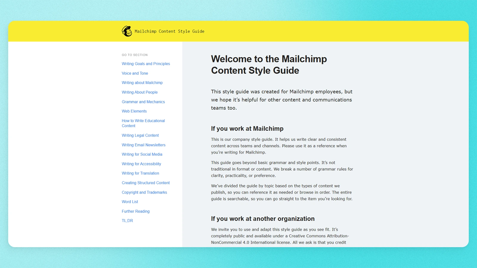
A simple opening section that says where to find logos, colors, fonts, downloads, and the current version is often more valuable than a page of brand adjectives. Mailchimp’s style guide is a good example of organizing guidance around practical topics people can find later, and Microsoft’s brand-kit model emphasizes accessible approved assets rather than just static documentation.
A good quick-start section can be as plain as:
- Use this logo first
- These are the brand colors
- These are the approved fonts
- Download assets here
- Current guide owner/contact
That’s enough to make the rest of the guide feel less like a maze.
2. Show every logo version, and when to use it
This is where a lot of guidelines stay too vague.
They show the primary logo, maybe the alternate logo, maybe a clear-space diagram, and then move on as if the client will naturally infer the rest.
They won’t.
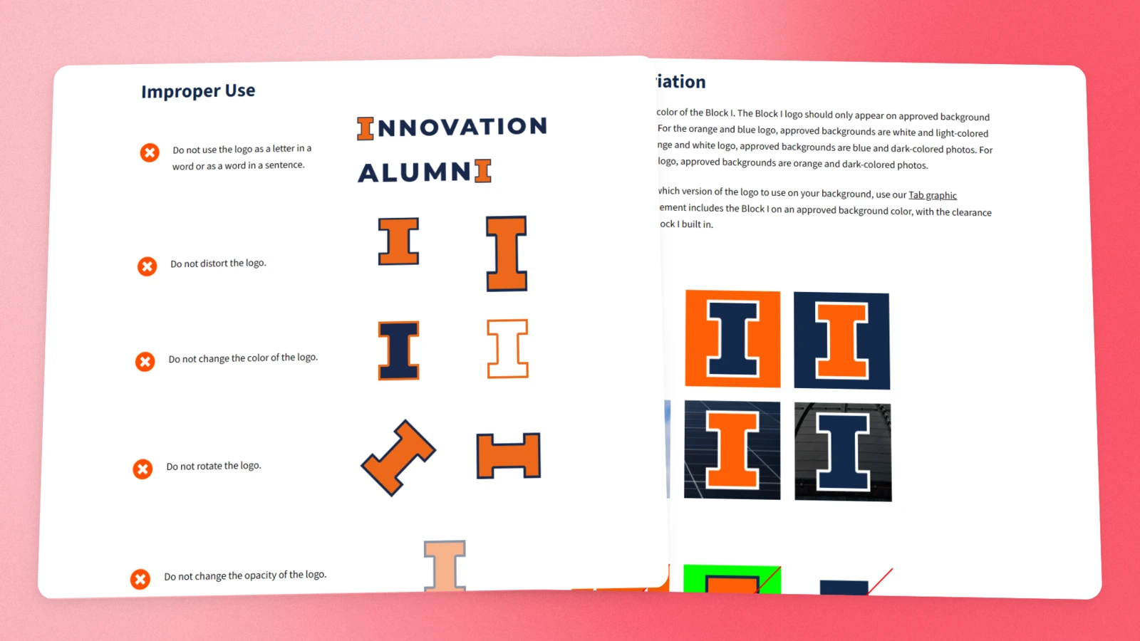
A strong official example here is Illinois. Their logo guidance covers primary and alternate marks, minimum sizes for print and screen, clear space, approved backgrounds, restricted single-color uses, improper transformations, and even recommended alt text for the mark.
That’s the standard to steal from, not in scale but in structure.
What a useful logo section should answer
- What is the primary mark?
- What are the approved alternates?
- When should each one be used?
- How small can it go?
- What backgrounds are okay?
- What’s not allowed?
- Where is the approved file?
The simple formula
A good logo page usually follows this pattern:
Variant → situation → constraint → example → file
For example:
- Primary logo: Use for most branded materials
- Stacked or compact version: Use when horizontal space is limited
- Reverse version: Use on approved dark backgrounds only
- Monochrome version: Use only when full color reproduction isn’t possible
Then show:
- clear space
- minimum size
- good and bad background examples
- a few believable misuse examples
- the actual approved file nearby
What good looks like
Good logo guidance is specific:
- “Use the compact mark for profile images and narrow placements.”
- “Do not place the full-color logo on low-contrast photography.”
- “Do not stretch, recolor, rotate, outline, add shadows, or reduce opacity.”
Bad logo guidance is generic:
- “Respect the logo.”
- “Use the logo consistently.”
Nobody knows what to do with that.
3. Turn the color palette into a system, not a swatch sheet
A list of hex codes is not a color system.
It’s inventory.
What people really need is help making choices.
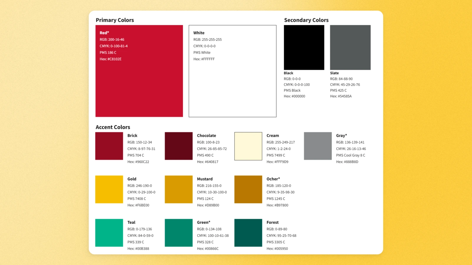
Illinois separates primary, secondary, and supporting colors and explains their roles. The University of Houston also maps color systems to real usage, with PMS and CMYK for most print and merchandise needs and RGB/HEX for digital use.
What a useful color section should answer
- What are the exact values?
- Which colors are primary?
- Which are supporting or accent colors?
- Which text/background combinations are approved?
- Which combinations should be avoided?
- Which values matter for digital, and which matter for print?
What to include
For most client projects:
- HEX for digital
- RGB if needed for digital workflows
- CMYK when print is part of the work
- PMS/spot colors only when the client actually needs spot-color production
Not every small brand needs Pantone values just because it feels official.
Accessibility belongs here, not as a vague footnote
For digital text, WCAG 2.2 Level AA requires at least 4.5:1 contrast for normal text and 3:1 for qualifying large text. Relevant non-text UI components and graphics also have a 3:1 contrast requirement, and color should not be the sole means of conveying information.
One important nuance: those normal text contrast rules do not apply to text that is part of a logo or brand name. So don’t tell clients “your logo must meet 4.5:1 WCAG contrast.” That’s not the standard.
The practical move is to show approved digital pairings right in the palette section.
For example:
- Navy background + white text = approved
- Light beige background + navy text = approved
- Coral background + white body text = avoid
- Accent yellow = use for highlights, not paragraph text
That’s much more useful than adding a final page that says “remember accessibility.”
4. Explain typography like a system, not a shopping list
“Heading font: X. Body font: Y.” is not enough.
Typography guidelines should reduce the number of decisions a client or future designer has to make. Illinois does this well by defining type roles, pairings, weights, styles, and substitutes for constrained environments.
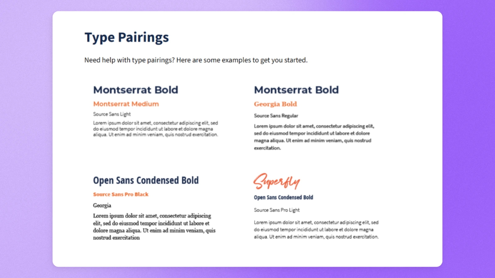
What a useful type section should answer
- Which typefaces are approved?
- What is each one for?
- Which weights and styles are allowed?
- What hierarchy should people use?
- What substitute should they use if the primary font isn’t available?
- Where do the fonts come from?
- What does the client need in order to use them legally?
That last question gets skipped a lot, and it’s one of the most useful parts of a good guide.
Font access is part of the guidelines
Adobe’s licensing docs make an important distinction:
- A client can receive rasterized or properly embedded outputs like PDFs, JPGs, and PNGs without separately licensing the same Adobe font just to view them.
- But if the client needs to directly edit the work using that typeface, they need their own appropriate license.
- Adobe also says Adobe Fonts can’t simply be packaged up and transferred to another unlicensed user or computer.
Google Fonts is a different case: Google states the fonts in Google Fonts are released under open-source licenses and can be used commercially and non-commercially.
What good looks like
A solid typography section usually includes:
- Typeface name
- Source/foundry
- Approved roles
- Approved weights/styles
- A small hierarchy example
- Substitute font if needed
- A short licensing/access note
For example:
- Display: Sora Bold
- Body: Inter Regular
- Fallback for Google Slides: Arial
- Font source: Google Fonts
- Client note: Install from Google Fonts before editing templates
Or:
- Headline: Neue Haas Grotesk Display
- Body: Source Serif
- Font source: Adobe Fonts / commercial foundry
- Client note: Editable use requires the client’s own licensed access where applicable
That tiny note can prevent a long email later.
5. Put examples next to the rules
This is the difference between a guide that looks polished and a guide that helps.
A specification tells people what the brand contains.
A useful guideline helps them choose correctly.
Illinois does this repeatedly with appropriate and inappropriate logo uses, practical type pairings, color usage, and applications.
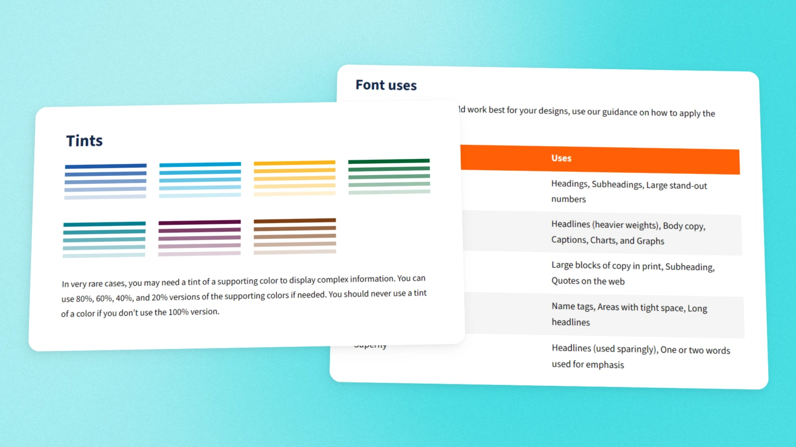
So instead of giving people abstract sections called:
- Logo
- Color
- Typography
Try answering actual decisions:
- Which logo goes on dark backgrounds?
- Which color should lead, and which ones are accents?
- Which font should the client use in PowerPoint?
- What should never happen to the mark?
- What kind of photo feels on-brand?
A few correct/incorrect examples are often more useful than another paragraph of explanation.
6. Asset access is part of the guidelines
This is the piece a lot of designers separate out, even though it’s half the job.
Guidelines answer what to do.
Assets answer what to use.
Microsoft’s current guidance explicitly distinguishes a collection of assets from the guidelines that govern how those assets should be used, and its newer Brand Kit model combines rules with approved assets, templates, imagery, voice, and other brand elements. SharePoint’s Brand Center is built around centralized access to current brand colors, fonts, images, and other assets.
That’s a useful model even if your client is nowhere near enterprise tooling.
What clear asset access includes
- Clear filenames
- Sensible folders or download groupings
- A plain-language note on what each file is for
- Formats that match real use cases
- One obvious place to get the approved version
Commonly useful file types
| Use | Commonly useful format |
|---|---|
| Scalable digital logo use | SVG |
| Transparent raster use | PNG |
| Photography | JPG or another client-compatible photo format |
| Fixed documents/artwork | |
| Professional production | Approved vector or print-ready source based on the project |
| Editable templates | Only in formats the client is actually expected and equipped to edit |
SVG matters because it’s a standardized vector graphics format, which makes it especially useful for scalable digital marks.
The key principle is not “include every file type.” It’s “make the intended use obvious.”
A logo download named logo-final-new-2.png is not a system.
7. Give the client one current source, not three almost-right ones
This is a boring section.
It is also one of the most important.
People don’t just need brand rules. They need to know where the current rules live.
That’s part of why centralized brand systems keep showing up in enterprise examples. Microsoft’s brand tooling and SharePoint Brand Center both emphasize managed, current assets rather than scattered duplicates.
At minimum, your guide should say:
- who owns the guide
- where the canonical version lives
- when it was last updated
- how to get new assets or ask questions
That does not mean PDF is dead.
It just means PDF is a format, not a complete guideline system.
Microsoft’s current workflow even allows a guideline PDF as an input into its brand-kit system.
So the problem isn’t “PDF bad.”
The problem is:
- old PDF in email
- newer PDF in Drive
- logos in a ZIP
- social templates in another folder
- nobody knows which version is real
That’s the actual failure.
Include these when they were actually designed
This is where scope discipline matters.
There are lots of sections that belong in some brand guidelines, but not all of them.
Photography and imagery
Include this if the brand has a recognizable image style, or if the client regularly commissions or selects imagery.
Illinois’s photography guidance covers things like focal point, context, authenticity, negative space, and end use. Dropbox and UH also include imagery or photography systems.

What good looks like:
- subject matter
- composition
- cropping
- lighting or treatment
- positive/negative examples
- approved source library if one exists
Illustration, iconography, and graphic devices
If these are part of the identity, document them like a system.
Dropbox explicitly includes iconography in its public guidelines, and both Illinois and UH include broader graphic systems.
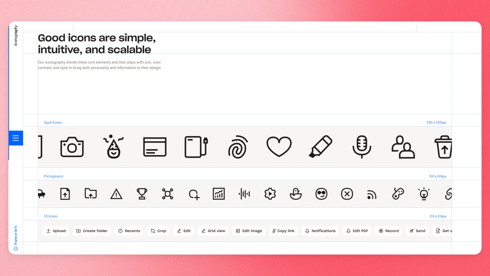
What good looks like:
- what assets exist
- how they combine with the logo and typography
- scale and spacing rules
- approved color use
- downloadable approved assets
Layout rules and templates
Include these when the identity includes repeatable composition logic or when the client repeatedly creates the same kinds of materials.
Microsoft’s current Brand Kit model explicitly includes templates and layouts as operational brand assets.
What good looks like:
- recurring grids
- spacing behavior
- relative scale
- common compositions
- an actual editable template, not just a mockup of one
Voice and tone
Only include this if verbal identity or messaging was actually part of the work.
Dropbox includes voice. Illinois has formal guidance around personality, voice, and tone. Mailchimp is a strong example of how deep verbal guidance can go when a content-heavy organization needs it.
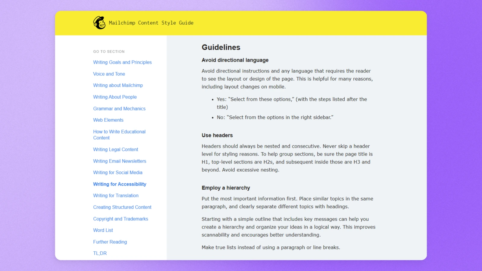
What good looks like:
- a few principles
- actual copy examples
- “this, not that” contrasts
- channel-specific notes if relevant
What doesn’t help:
- six adjectives with no examples
- inventing a tone-of-voice framework while building the guide because the document felt too short
Motion
Motion only belongs if motion was designed.
Dropbox treats motion as a first-class part of its system. UH also covers video.
If it’s in scope, document:
- logo animation rules
- timing
- easing/behavior
- transitions
- title or social video patterns
If it wasn’t in scope, don’t fake a motion section just to make the guide look modern.
Specialized sections for bigger or more technical brands
Some guideline sections are real needs — just not universal ones.
These tend to show up in more complex organizations, product teams, or channel-heavy brands.
Common specialized additions
- Co-branding and partner lockups
- Data visualization rules
- Packaging and merchandise specs
- Trademark or legal usage notes
- Localization and multilingual typography
- Product UI implementation guidance
- Design tokens for digital systems
- Multi-brand architecture
Design tokens are especially relevant for digital product clients. In 2025, the W3C Design Tokens Community Group announced the first stable version of a vendor-neutral format for sharing design decisions like colors, typography, and spacing across tools and platforms.
That matters for some projects.
It does not mean every freelance logo package needs tokens.
What not to include just to look comprehensive
This is the part nobody says out loud enough:
Do not create fake depth.
A visual identity project does not automatically need:
- a founder story section
- a brand strategy chapter
- a verbal identity system
- a motion system
- merchandise rules
- social templates
- Pantone specs
- co-branding rules
- design tokens
Include those when they were designed, sold, or genuinely needed.
Not because the PDF looked a little thin.
There isn’t one universal brand-guideline table of contents. The official examples above vary widely because their operating needs vary widely.
So don’t scope your guide around “comprehensive.”
Scope it around repeated decisions.
A useful modern guideline model: keep the rules close to the files
One of the clearest patterns in current brand systems is that guidelines and assets are moving closer together.
That’s good news for freelancers, because it matches the real work of building useful guidelines.
The client doesn’t just need: “Use this logo.”
They need: “Use this logo here, and here’s the approved file.”
They don’t just need: “These are the fonts.”
They need: “These are the fonts, here’s where they come from, and here’s what you need to edit the templates legally.”
That’s also why online brand guidelines are more interesting than just “a prettier PDF.” When the guide itself becomes the place people return to for the rule, the example, and the file, the system gets easier to use.
That’s the appeal of a tool like Brand Bento in this context: the guide can become one clear place for finished brand work instead of another document living beside a ZIP and a folder link. Keep the PDF if it suits the project. Just don’t confuse format with usefulness.
Final checklist: what should actually be in brand guidelines?
Use this before you publish or share the guide.
Essential
- The guide opens with fast answers: logos, colors, fonts, files, and where the current version lives
- The primary logo is obvious
- Every supplied logo variant has a clear purpose
- Logo guidance covers clear space, minimum size, background rules, and misuse where relevant
- Brand colors include the values the client actually needs for their channels
- The palette explains roles, not just codes
- Approved digital text/background pairings are shown where relevant
- Typography includes roles, weights, styles, and a basic hierarchy
- Font source and licensing/access notes are included
- Approved assets are easy to download or locate
- Filenames and file purposes are obvious
- One current source, owner, or update path is clearly identified
Include if designed
- Photography or imagery direction
- Illustration, iconography, or graphic devices
- Layout rules or composition patterns
- Editable templates
- Voice and tone
- Motion or video behavior
Specialized
- Co-branding rules
- Packaging or merchandise specs
- Data visualization guidance
- Localization or multilingual support
- Product implementation notes
- Design tokens
- Trademark or legal usage guidance
Quality check
For every section, make sure the guide answers:
- What is it?
- When do I use it?
- What should I avoid?
- Where is the approved asset?
- If this is editable, how does the client access it properly?
The short version
If you want the shortest honest answer to the title:
Brand guidelines should contain whatever someone needs to apply the brand correctly, confidently, and repeatedly without guessing.
For most freelance identity projects, that means:
- logo rules
- color rules
- typography rules
- examples of correct use
- approved asset access
- one clear place to come back to
Everything else is conditional.
That’s the real test. Not whether the guide feels “complete,” but whether it helps the brand survive after you send the files.